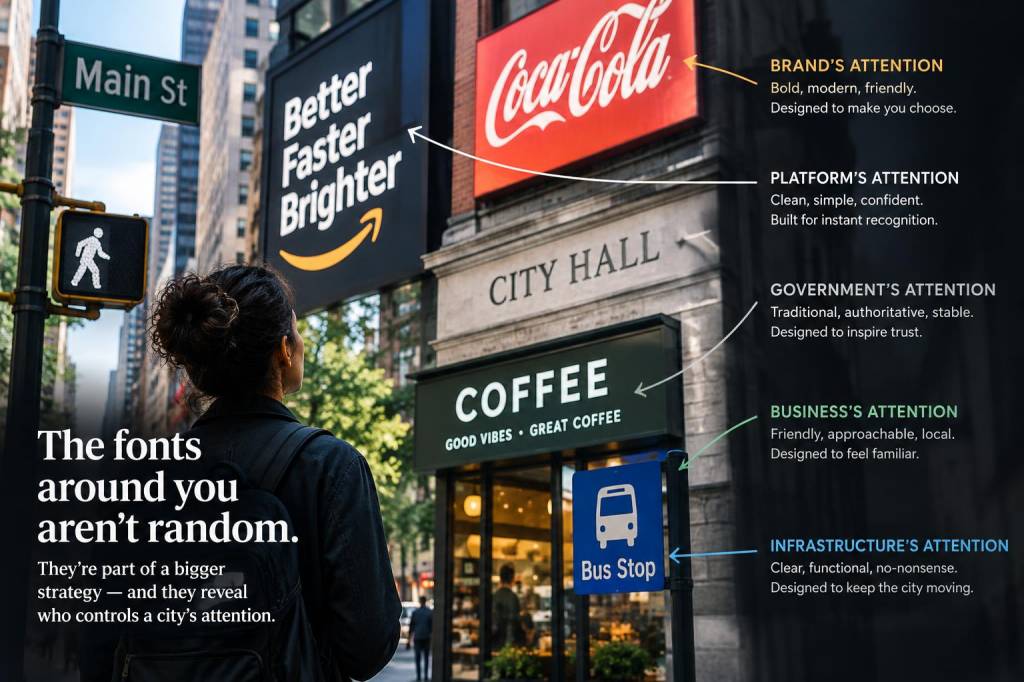
I was walking through a neighbourhood I thought I knew well when a new shopfront made me stop. It wasn’t the colour or the products in the window that caught my eye, but the typeface on the sign: a tight, geometric sans with an almost clinical silence to it. I realised, with a small, private thrill, that I had been trained to notice fonts in the same way someone else might notice birds — once you start, you can’t stop. The fonts on everyday signs are a kind of civic whisper. They tell us, quietly but insistently, who is steering our attention and what kind of attention they want.
Fonts as urban cues: what we’re being asked to do
Typefaces are instructions. A sign that uses a bold, condensed grotesque is urging you to move quickly: buy, board, watch. A friendly rounded type asks you to linger, to imagine a softer transaction. When city authorities select a font for wayfinding — think Transport for London’s Johnston, or the airport signage that leans on Frutiger — they are designing not only legibility but behaviour. These fonts are battle-tested for speed of recognition and clarity from a distance. That clarity serves an obvious public good: safety, ease of movement, reducing cognitive load.
But what about the other signs? The ones on private buildings, cafés, pop-up stalls and political posters? Here, font choices reveal competing intentions. Commercial designers often use distinctive typefaces to carve out attention within an urban soundscape. A shop with a bespoke serif is saying, in typographic terms: “We are curated; our goods are thoughtful.” A neon script implies a kind of bohemian warmth. When multiple of these claims collide on a single street, the city becomes a conversation of fonts — and the loudest, clearest or most familiar ones win our glance.
Who gets the right to shape attention?
There’s a power dynamic embedded in typography. Municipal authorities, large corporations and heritage organisations have resources to commission custom typefaces and control large swathes of visual territory. Consider the subtle dominance of government-branded fonts on street furniture, or the ubiquity of corporate fonts across bank branches. These choices normalise a visual language. When a city adopts a unified typeface for its signage, it’s not just improving legibility; it’s asserting an aesthetic authority over the public realm.
By contrast, grassroots groups, small businesses and street vendors often work with off-the-shelf fonts or hand-painted lettering. Their typographic voice can be more heterodox and intimate, but also more fragile — easily erased or squeezed out by corporate standardisation. The question of who gets to shape attention isn’t neutral: it reflects money, jurisdiction and cultural capital. Typography becomes another layer in the politics of visibility.
Fonts and the economy of attention
We live inside economies of attention. Cities are crowded not just with bodies but with competing signifiers demanding gaze. Typeface choice is a tactic in that economy. A city that feels calming often has coherent public signage and restrained commercial advertising. A more frenetic place will be typographically loud: neon logos, mismatched fonts shouting for clicks from a passerby’s eyeball.
Advertising agencies understand this. They use font pairing, scale and negative space to guide our gaze along a specific path: from headline, to image, to call-to-action. Even in the absence of a campaign, the ambient typography of a neighbourhood — the density of bold sanses, the recurrence of a serif across multiple shopfronts — shapes mood. You may not remember a particular font, but you’ll register the collective temperament it creates: efficient, playful, upscale, serviceable.
Legibility versus charm: compromises in design
There are moments when legibility and aesthetic intent pull in different directions. A beautifully lettered artisan sign might be impossible to read at a glance; an emergency exit sign must sacrifice charm for clarity. Cities often have to balance these demands. Wayfinding systems prioritise legibility, prescribing standardized type sizes, contrasts and spacing. Historic districts, however, might tolerate more varied signage in the name of character.
These compromises are revealing. They say what a city values and when. In tourist zones, you’ll see a blend of legible maps and decorative signage designed to photograph well. In neighbourhoods where commerce is local and human-scale, hand-painted signs persist, because legibility in the strictest sense isn’t always the point: the sign communicates relationally, to a habitual audience who know the context.
Fonts as cultural markers
Typefaces carry cultural freight. Helvetica can evoke modernist efficiency, while a gothic script may summon craft beer or vintage aesthetics. Municipal typefaces can also become symbols of identity. The Johnston typeface for London has been in the city’s visual DNA for over a century; it signals civic continuity. New York’s subway signage, while not monolithic in type, has its own typographic rhythm that suggests grit and movement.
When a city rebrands its typography, the act can feel political. A new municipal font may be pitched as “fresh” or “inclusive,” but it also signals a shift in who is being listened to. Change can be democratic — designed to improve accessibility for readers with visual impairments — or it can be a cosmetic refresh that aligns public aesthetics with corporate trends. Either way, such decisions matter. They alter the quietly shared visual language through which strangers coordinate everyday life.
Personal habits of noticing
Noticing fonts has altered my walking practice. I find myself cataloguing scenes: a hospital sign’s sober sans, a microbrewery’s heavy slab serif, a political poster’s hurried marker pen. These observations have taught me empathy for design constraints. A councillor’s office might choose a neutral font to avoid alienating constituencies; a café owner may pick a retro script that signals a particular taste horizon. Fonts are decisions made under pressure — budgets, local regulations, landlord restrictions — and understanding that has made me less inclined to mock and more likely to ask curious questions.
I also notice how fonts shape my own attention. In an airport, a large, high-contrast type pulls me toward the check-in queue with less effort than any spoken announcement. In a gallery, an elegant serif on the wall gives the text an aura of seriousness that affects how I receive the art. Typography is one of those design elements that operates below the threshold of conscious awareness while persistently steering cognition.
Small acts that change who controls attention
If you want to rethink who shapes a city’s attention, start small. Support independent shops that use distinctive, locally made signage. Encourage councils to adopt typefaces selected for accessibility and inclusivity, not just slick branding. Advocate for signage policies that protect hand-painted and vernacular lettering in heritage areas. These are incremental interventions, but they matter: they keep a plurality of typographic voices alive.
And when you walk, try this tiny experiment: look up and catalog the top five typefaces you encounter in a single block. You’ll begin to perceive the invisible choreography of a place — the municipal, the commercial and the vernacular each playing their part. Fonts will remain, for most people, a background hum. But once you learn to listen, that hum reveals who is conducting the city, and, sometimes, who is being left out of the orchestra.